Friday 30 March 2012

Drawings

As I've been back at home for easter I decided to get some pencils out and just do some drawing. As I had been doing self promotion work before finishing for easter I'd not done much on the project and thought it would be a way of getting back to it.


Foxes are becoming more and more apparent in what will be in the final pieces. I think with the symbolism of the fox in the story it will definitely be used symbolically in the final images 


I was also thinking about the character of Mabel, and trying to capture her character. 

This was more out of want than need but it was really nice to spend a few days drawing. With paper cutting, and using watercolour, I think it's good to have good drawing behind it as that will create a better image. So it's always nice to go back to basics sometimes. 

Monday 26 March 2012

New Images


I was thinking about my self promo project and what I would have done differently. I thought it would have been better to have made a wallet for the pop up rather than cover. This lead on to thinking about possible new images based around the actual project.


I came up with this idea, using the fox footprints as a container for other images of wildlife. I thought about different seasons, seeing one as more of an autumnal scene and the other as more of a spring scene. I chose deer and a hare as it seemed universal enough to not be specific to one area but were also animals from western countries such as America. The fox in the story represents the wildness and so I thought using the fox footprints were a good symbol of that. It also relates to tracking and hunting; finding footprints in the snow is a common feature in the story. 


My details I hand wrote and then cut out. I used a hand drawn type as I feel it relates better to my way of working traditionally.

This side project has brought out quite a few ideas for my final project. I would like to continue looking at the representation of the wilderness and the changing seasons and how they are used as metaphors in the story. I think I'll keep these pieces aside to look at possibly using them for self promotion after my project has come to an end. As the project is finished now I want to concentrate on my final major, of which this can be a part of. 


I printed off pictures of the northern lights again and placed them under the cut. I like the mix of colour behind the muted colour. 


Friday 23 March 2012

Johnny Toaster presents: Pointless Posters

Wednesday 21st March was the opening of The Pointless Posters exhibition I was part of. 20 of the 3rd year Illustration students created designs to be screenprinted for a 'pointless poster'. The range of ideas and images are as diverse as the title allowed us to be. Posters are there to advertise, inform, persuade amongst other things; they have a purpose. The idea came from thinking what if images were put up that had no real meaning to them; they weren't trying to effect you for any particular reason. 

The pieces are going to be displayed for two months, I think, at The Soul Cellar in Southampton. And there are copies of each artwork available to buy. 


My design in on the far right, it's a section of lyrics to a Lana Del Rey song; Video Games. 


This was a piece done by Nichol which I've included to show the diversity of ideas. The colours used were CMYK; Cyan, Magenta, Yellow and Black. All posters were printed on a light grey paper and all were one colour on top. This was to create a unity in the collection. 


Here is one of my unframed posters which are up for sale. While I was trying to think of what to do for this exhibition Lana Del Rey's album had just come out and I really liked 'Video Games' of which this line is a lyric. I thought it would be fun to take a line and use that to play with type and handwritten text. With the brief being so open, pretty much anything was accepted so long as there was no point to it and there we have it. There is no point to this design. 


These are just in and around the cafe, the work is dotted all over the place. 


Here is my hand drawn draft for the poster. I was originally going to cut it out but decided I liked the fainter lines where I had been adjusting to get right placements and shapes. These would be picked up when the work got exposed for screenprinting and so I decided to keep it like this. You can see the marks came out in the screenprinted version. 

(All above photographs are my own. All artwork seen is either my own or work of 3rd year students at Southampton Solent University) 


Wednesday 14 March 2012

Self promotion: Final piece

Since my last post about my self promotion project I've managed to decide on a design for the interior and start creating the actual pieces. I decided to go with the box design as I thought it would be relatively simple to make but still look interesting. I also wanted to use the lazer cutter at university, and this was a perfect excuse to try it out.


To recap. here was by first mock up that I posted in my last self promotion post.


I made an accurate template, taking into consideration things like the thickness of the paper I was using; watercolour paper, which is thicker and more textured than the cartridge and printing paper I had used for the mock ups. I added a few extra mm's to account of the space lost in folding which was a guess but I thought always better to have too much than not enough. 


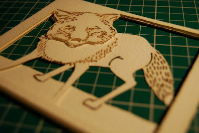
Here is the design for the inside. The design separates into 3 pieces onto 3 sheets to go inside the boxed container. To use the lazer cutter, the image has to be scanned in and transferred into Illustrator. The outline can be made as a path so that the lazer will just cut along it and not take around the two sides of the black line. For the bits in the middle, a red marker has to go around the black pieces that are to be cut all the way around the black line. Once that is done it's straight forward to get multiple pieces cut out. Each set of 3 took 6 minutes to cut out. 


Here is the entire stack of cut out sheets I had by the end of the day.


One set layered up creates shadows which create the definition of the small cut out marks. This piece I layered up with come double sided foam to keep for myself. The lazer cutter also picked out little marks from the scan and cut these pieces out too, I think these pieces become part of the aesthetic and look quite nice. They fit with the slightly burnt edges that come as a result of the lazer.


Here are the 3 separate sheets. 


And here are the sets together. I found that the lazer cutter made it so easy to create as many identical cuts as I needed. It can be used in the future for fundraising/selling pieces and will also prove helpful if I want to carry on with making bigger pieces to exhibit.


I tried colouring a few in to see what they would look like. I liked the red fox but think the piece stands well enough by itself as you can see the marks made by the lazer cutter and I think it has a nice aesthetic by itself. For more one-off pieces though I think the colour will be nice; it's definitely something I can look a with my main project.


The box was easy to make once I had the template. I just had to mark and score in the fold lines. I think to do this on a larger scale I would use the lazer cut machine again but I wanted to make sure this was clean cut and accurate to make sure everything fitted together. 


The sheets were attached to two separate strips as it would be easy to slide these into the box and attach them rather than trying to attach them to the sides inside of the template. The sides were folded on both sides, facing opposite ways so they will all flatten down. 


In the box unattached.


All done. 

(All above images are my own, all artwork shown has been made by myself)

I am really pleased with this piece and I think it's opened up a lot of opportunities in the future to think about using the same techniques. 


Friday 9 March 2012

Paper Creatures

I made these with some pritt stick and a bit of guess-timation so they aren't the best pieces of sculpture ever created but I wanted to try out making actual models again like I had done at the beginning of the year with a Polar Bear and a break from my dissertation. I have been thinking about creating these models to hang so they were held in a pose. At the moment my friend, Hannah, is the only thing supporting them;


This is the polar bear model I made back in october time, the idea has been hanging around for a while. I  try to get the basic shapes with curving and bending the paper but still retain the qualities of the material I'm using.


The Fox is the most successful I think, as I have been studying the shape of foxes a lot recently in drawing for this project. A lot of this is just working out how I need to fix pieces together to hold the shape and to hold it steady. 


(All above images are my own)

I have also thought about the girl in the story, a woman by the end, who just disappears. I thought about the connection of the characters to the landscape and changing seasons, and how her disappearance could be shown as winter changes to spring. The strips where there because I had no other means of creating a floating/dispersing look from material. My idea was to have a figure; the 'snow child' of the story literally disappear into Spring, as blossom and leaves. Her arm in outstretched in this model as i thought about pieces leaving her and the position shows her watching them. I thought there would be something nice about that small moment, as if she is letting herself go. 

I definitely had this image; 'While You Where Sleeping' by Su Blackwell in my mind while I was thinking about it. I like the pastel colours in the material and the idea for the aesthetic is similar to my own. I want to work on creating a good shape for the body if I where to carry on with this idea, and possibly include legs as well; as the girl 'runs' away it would be good to capture that act of escape. She doesn't run literally but the act of her leaving could be shown in the position of the figure.


(image from Constant Siege)


I had drawn a sketch of an fox. I've been thinking of making something to either hang in pieces or make, possibly the fox, for the final show. I would be nice to take my interest in paper craft and modelling further.


Friday 2 March 2012

Guest Lecture: Laura Carlin

I had been aware of Laura Carlin's work before this lecture, I had seen The Iron Man reprint that she illustrated and was looking forward to seeing her other work and to her talking about her work.

Laura works primarily in her sketchbook. During her time studying she had to decide what the point of her work in sketchbooks were, and what she could do with them. During a trip to Tokyo she drew people and drew from life; always enjoying people watching, and created a printed book called 10 days in Tokyo. I really liked her drawings and thought they were put together really well.

Her interests lie in quite dark humour, I think that comes across in her illustrations. She said the commissions that came through were for quite dark subjects; in one piece on sexual trafficking she spoke about trying to create empathy through illustration.


I really liked seeing her 3D work. It's very simple but effective. I like the slight shadows cast and how simply it's been created. This relates quite well to what I am doing in my own project as I am looking at the use of paper and how to create images out of it. It would be good to look at creating things simply.


I also really like Laura's use of colour, it's quite muted and goes back to the dark and sad elements in her work. I liked her take on children's illustration, allowing and being more open to darker subjects. I think with the book I'm working with alongside magical and fantastical moments there are moments that are a lot darker and harsher and so it was nice to see how tackling harder subjects are through Laura's illustration. I think Laura's talk has been the most beneficial to me so far. I would have liked the chance to have spoken to her about my work but I enjoyed her talk.