Monday 27 February 2012

Self Promotion work in progress

The deadline for the Self Promotion project has kind of creeped up on me. I started thinking about it over the weekend. Really I had no ideas on what to create to send out to art directors. The project seems almost too broad - I mean you can essentially do anything, nothing related to our current projects or past projects but a collection or piece that demonstrates your abilities and style as an illustrator.

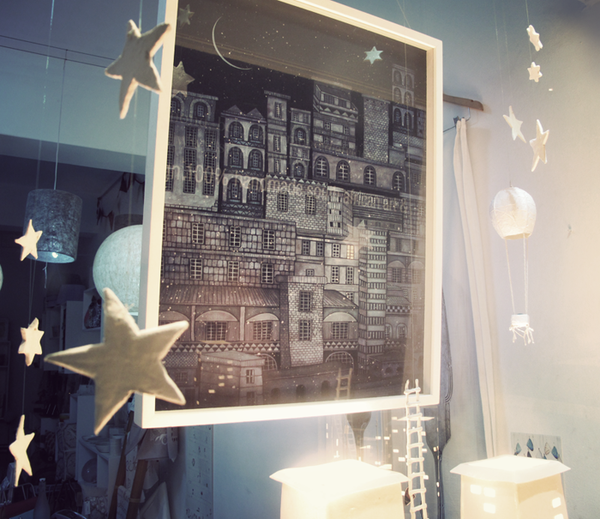
What I had wanted to do was create a personalised banner for this blog, which does act as part of the self promotion project.


I drew out the design I had in my head but traced the writing so I could reverse it. I had original thought of having the cut as one joined piece, where the stars, moon and letters were attached. 


But I soon decided to cut all pieces separately and hang them with thread, this would give a little more freedom in how they hung and what shadows they would make if I photographed it. All this joined lettering was cut out without any rips and I wanted to jump up from my chair and fist punch the air when I completed it, but it was 2am so I didn't and just went to bed. 


I joined the pieces with blue thread, as the deep colour is similar to the colour of the sky and thought it would look nice really. A trick in theatrical illusion is to have dark rope to blend in with the background so something would look like it was floating. 


I like the use of both mobile and shadow with these photographs. The light catches the paper making some parts white and others darker creating a nice mix of shades with the shadow on the wall behind. I like the overlapping letters and how it looks like there are more stars than there actually are.


I photographed the image straight on quite a few times as the moving stars and letters created different shapes and shadows. I liked that even if one of the paper cuts had moved so that it was unreadable in the picture the shadow picks it up and vise versa; the cut can be readable but the shadow can't.


This is one of my favourite shots, it cuts the word in half pretty much and has one part in paper cut and the other in shadow. I also like the extreme light and dark in the paper cut word. 


The ones where I tried to get just the shadow didn't come out as well. I think I preferred this image with the paper in the frame as well. Aesthetically I like the hanging thread pieces which you can see and I think it has echoes of set pieces from older theatrical productions. 


I also thought about what it could be that sent out, I thought this idea of shadow, light and paper cuts could be incorporated but it would be too fragile to send out something like this banner. I thought of making a concertina type leaflet which could stand up, I was specifically thinking of things that would be interactive as I think that is the most memorable thing about something if you're handed a pile of people's work every day, and making something interactive is fun anyway. 


First I quickly made a concertina style book. I thought about having a story unfold itself as you opened more folds. Just using a simple narrative, for this one I just used a few images from the story I am currently working on. There is also the possibility of creating an image as you open the first page and look down at the layered pages. 


A slightly more complex idea I had was to create something that could pop up from a folded down piece of paper. My friend suggested, once I had made the body, that I add a cover so the set moves into place naturally as you open the booklet. As you can see in the second and third images, there is possibilities for layering. 


Here is the same idea, I was considering where my contact information could go. 


And some more images of the concertina book. 

I am still unsure of which book style to go for but I think it would be fun to go for the 'set' style book. I think I will have to think more about how to create it a little more seamlessly and think of an appropriate image for a paper cut to be inside. 


Research: Studio Muti window display

I came across some photos of a window display by a collective known as 'Studio Muti' based in Cape Town, South Africa. The display I looked at was a collaboration between the two members of Studio Muti; Clinton Campbell and Miné Jonker, and their friend, ceramic artist Belinda Ormond.

" We created an artwork and conceptualized a window display for 'The Fringe On Kloof', a Cape Town gallery and shop that stocks prints, ceramic art and jewellery from local artists. (www.thefringearts.co.za). Prints are for sale at the shop." (From behance.net/muti) 


The piece was based on a poem by e.e cummings.

who knows if the moon's:


who knows if the moon's
a balloon,coming out of a keen city
in the sky--filled with pretty people?
(and if you and i should


get into it,if they
should take me and take you into their balloon,
why then
we'd go up higher with all the pretty people


than houses and steeples and clouds:
go sailing
away and away sailing into a keen
city which nobody's ever visited,where


always
it's
Spring)and everyone's
in love and flowers pick themselves


(all above images from behance.net/muti)

The installation shows elements of the poem like the balloon, the night sky and the city. This seems similar to my take on the text I am using at the moment; taking the literal and extracting it but retaining the symbolic elements in the images. 
But I what I really liked about this installation was the use of light and colour. The blue and yellow light evokes the night city scene. This light gives a dreamlike quality which is further shown with the ladder and the balloon, as well as the stars hanging. 


Saturday 25 February 2012

Paper Cut: Faina

I had another idea to create a piece that described the girl, Faina's connection to the landscape.

I thought about creating the body or head from images of the landscape. Here I've looked back at the images of the northern lights I had worked on earlier in the project and thought about creating another sky image.


For the final image I added the wilderness below so it looks as though the landscape becomes the body. I also tried a few different colouring changes and cropped them differently. I think I like the image when you can't see the edge of the sky although I tried to give it a rough head shape. 

This was just an idea I thought I should try out. I don't think it was completely successful as the bottom and top sections seem a little disjointed. I don't think I'll continue on in this kind of style although there are some parts I like about it for example the bleed from the colour into the white. I also like the trees cut out from the paper to create a slightly 3D affect.


Wednesday 22 February 2012

A trip to London

We had a study trip to London today, I'm shattered so please excuse any spelling mistakes or poor grammar.

Everyone who went on the trip today wrote their name under a tutor and we were going to be taken on our own 'tour' of London.  I signed up with Derek Rogers and had no idea where we were to go before we started.

I come from London and often spend a lot of my holiday and breaks from university in the city; I see a lot of theate, go to museums and shops and just generally sit in parks sunbathing with friends. It was nice to be back and to have the possibility of going places I wouldn't usually go in one whole day. It was also nice to experience the city with people who live elsewhere and have different reasons for visiting London - a few in our group hadn't been to London at all.

The reason for the trip was to collect research for current projects if needed but mainly to draw with the intention of entering the Transport for London Museums illustration competition; Secret London. The guidelines ask us to 'depict little known or unusual aspects of the Capital's history, culture, characters and communities - past or present. This is an exciting challenge for artists to celebrate a vibrant, multi-layered London in a way it has never been seen before.' This is something I'm quite interested in doing, as I love my home town and would enjoy creating something based on the places I like to go to, mainly around Soho.

During the day we had to re-adjust our plans as the weather meant it wouldn't be possible to draw outside. We decided to go into the Tate Modern to see an exhibition for artist Yayoi Kusama as her installations were apparently very interesting. I wasn't blown away by most of the work on show. It's a matter of my own taste, though, not artistic ability. I did like being able to see Kusama's work develop throughout her life, and to see the reoccurring images appear in new work. I found her work to be very experimental and very controversial, especially her work during the 60s and 70s where she encouraged nudity in a public performance where people would paint polka-dots on each other. The polka-dots remained a theme throughout and the second to last room contained a mock up of a living space lit with UV.

The room that made the exhibition though was the very last one. Mirrors covered the walls and ceiling, and. apart from a walkway, the floor was dropped and filled with water. Hanging down throughout the whole room were strings of lights that changed colour. Looking around, up and down the room felt never ending. You couldn't really see where the wall ended and where the mirror started reflecting. It felt like you were stood in the middle of floating lanterns or something similar and it was really magical.

The exhibition didn't really relate that much to my project but I really liked the last room and found it very inspirational just in terms of use of space and materials.

These are some photos I took on a disposable camera. I decided it would be nice to use a film camera and see what I got from it, as I live in London I wasn't interested in capturing things perfectly.


There was a protest outside st Pauls. I'm not too sure what they were protesting in the end, all signs seemed to be saying different things. But I quite liked this one. Unfortunately it seemed a lot of the protesters didn't really seem to follow what they had hanging over their camp.


This is the one photo I got inside the last room in the Kusama exhibition.

This is looking out from st Pauls. I like the quality in the film photographs. 


Monday 20 February 2012

Web Presence Tutorial


Today we had a web presence tutorial by Chris Arran. He talked to us about creating an online portfolio and website. The best way to present your work is clearly and straightforward. He showed us the website called 'Carbonmade' which is a free online portfolio site. The site lets you create projects for collections of work and has a portfolio section along with a profile section.
Chris gave us tips like keep the background white as your work will usually be printed with white paper around it and to write about influences and interests in your bio.

The site is really easy to use and change around. The finished portfolio looks clean and professional and easy to access.
Here is a link to my portfolio I created on the day:

http://hannahisabelle.carbonmade.com/

Sunday 19 February 2012

Our Bargate Exhibition

Our exhibition at the Bargate Monument Gallery has just come to a close. All in all I think it was a success. Despite the cold building and steepest steps I've ever had to walk up we got a lot of visitors who showed positive interest in our work. The comments left in our comment book were lovely and some were particularly directed at my own work which was really nice to read. I think the experience was useful as it prepped us for our final show later on in the year. Setting the show up seemed to be a bit of free-for-all which came together in the end. This was good though as it taught us we need to be more organised for our final show. 


Here is the gallery from the far end, looking towards the entrance.


Here are the two pieces I had on show on the walls. I also had a few pieces on display in the cabinets. 

Saturday 18 February 2012

Northern Lights


Continuing on from the last paper cut using text from the book I've looked at cutting into images from the landscape. The book has a strong sense of place and I would like to use that to inspire my images. 


I tried several attempts at creating the northern lights myself, but didn't like how they turned out and much prefer the cut into the photograph. It's hard to get the colours and the vibrancy of them in paint. 


Research: Alaska in the 1920s

 Reading through the novel I am finding things I can't visualise because I've not encountered them. I thought it was necessary to spend some time looking online at the time period the story is set. I've gathered some photographs and information which will help me have a greater sense of the time and place.
I gathered some photographs which will help me picture the changing landscape; Alaska in snow and in lush summer weather. As the landscape is important to the symbolism for the story and characters then it is important for me to have a good idea of how the landscape looks, what is found there and how these change during the changing seasons; as seasonal change is integral to the story and symbolism too.


I looked at clothing and dress from the time. A lot of furs would be worn in winter. This photo is of a worker on the railroad which is being built during the story.


Homes were handbuilt and made of wood from the trees in the surrounding area. In the story a cabin is built by two of the characters.


On a homestead you would have farming land and build on that land. During the spring and summer you would farm the feilds for income and food. 


In the summer months the landscape is lush and green. The books describes a lot of different flowers and plants. There is still snow up in the mountains. 


Marshlands are also mentioned. A boy, Garrett, sees Faina for the first time her killing a swan. There is also a lot of mentions of wildlife. Hunting and trapping were also a way of living and eating.


I feel like the winter months must be the loneliest and the hardest for life on an Alaskan homestead. At the beginning of the story the landscape reflects Mabel's emptiness and grief. The joy the child brings comes out of the wilderness in winter and leaves in spring and summer. I think the months in which events happen in the book relate to the fruitfulness and then barrenness of the landscape. Mabel walks over the frozen river at the beginning of the story in a moment of despair, once Faina becomes more civilized she comes back in the spring and summer months and seems more real; she tans and leaves heavier footprints in the earth. 

This has been a useful exercise in helping me imagine the world where this story takes place. You can see the links to the stories events in the landscape and wilderness. The book has a mix of fantastical and fairytale with real and severe situations which reflects the beauty and magic and harshness of the landscape.